as you can see by looking at our
banner gallery we've had an etensive variety of random banners... most that make no sense, and by looking at some of the older ones in the new design, they looked pretty shitty. I got bored and sat down to recreate the banner from scratch, and came up with something I think is rather nifty.

I was thinking of having whatever is in mankind's place randomly switch to other people, but the rest of the header always stays the same. Somethign seemed off here though... it seems very plain...

maybe get some blue going on? I think the blue border around the site, albeit something I did by accident, is a nice touch. it makes the blue text stand out less. the only reason we even used blue tet to begin with is because the entirely gray site looked very boring. I always had a quip with it though. The blue here is kind of a kickback to one of
THI's older designs.

also, that big gray spot over the header looks stupid, lets get rid of it.

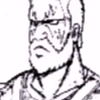
I got tired of looking at mankind's ugly face while working on this.

then I got tired of robert garcia, but zangief gave me a great idea.

obviously this is a shitty rough draft, but if I cut things right, I could have people reaching over or under the actual banner to give it less of a flat feeling. the original idea was to have zangief grabbing the top of the banner.


just having the background showing on top of hte banner was kind of ugly, and I needed to make a space for when we impliment an awesome feature we are working on, so I did the above. once we start usign the banner we might jsut have the site link with the forums and display login info up there till we get our real idea off the ground.


and here are some of the characters we are gonna use. we also decided to make "a website about EVERYTHING" randomly change to say other things.
feedback? comments? complaints?