| Author |
Message |
Syd Lexia
Site Admin
Title: Pop Culture Junkie
Joined: Jul 30 2005
Location: Wakefield, MA
Posts: 24869

|
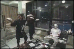
So I've been fixing up some of the index images. I hope to get better screengrabs for some of the live action stuff too, like the Salute Your Shorts and November Rain articles.
Here are some of the changes:
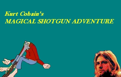
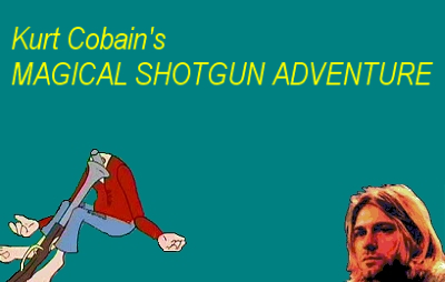
Obey Your Masters
OLD:

NEW:
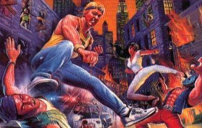
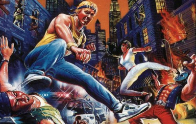
Streets of Rage
OLD:
NEW:
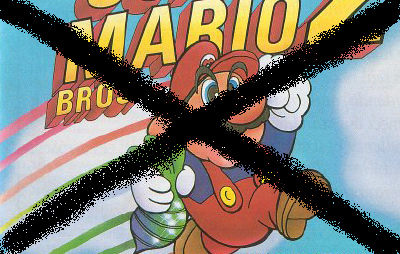
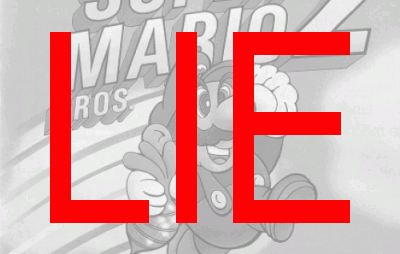
SMB2J
OLD:
NEW:
You Can't Do That On Television
OLD:
NEW:
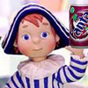
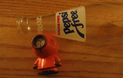
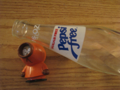
Pepsi Free
OLD:
NEW:
|
|
|
     |
|
|
Andrew Man
Title: Is a Funklord
Joined: Jan 30 2007
Location: Annandale, VA
Posts: 5603
|
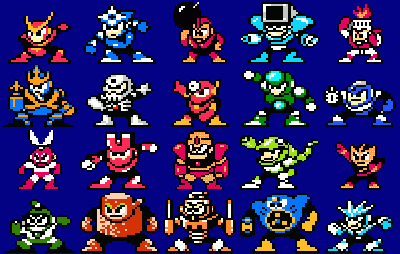
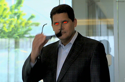
I like the seizure inducing Robot Master upgrade. The SOR one looks pretty good as well, Axl looks so serious in that pic.
|
 My Muzaks! CHECK IT OUT!!!
http://www.facebook.com/hellodharmaband
3DS is very good, and Wii U!
 |
|
|
|
|
UsaSatsui
Title: The White Rabbit
Joined: May 25 2008
Location: Hiding
Posts: 7565
|
Blinky stuff is annoying as hell.
The other pictures look great, though.
|
|
|
|
|
|
SoldierHawk
Moderator
Title: Warrior-Poet
Joined: Jan 15 2009
Location: San Diego, CA
Posts: 6085
|
I kinda have to agree about the blinking...personally that kind of stuff drives me crazy. But, it does get one's attention.
|
| William Shakespeare wrote: |
| Love all, trust a few, do wrong to none. |
|
|
|
|
|
Optimist With Doubts
Title: Titlating
Joined: Dec 17 2007
Posts: 5042
|
|
 |
|
|
Sarge
Title: The Self-Titler
Joined: Aug 14 2010
Posts: 598
|
I can handle the blinky, but I like the old Mario 2 spray paint.
|
|
|
|
|
|
Syd Lexia
Site Admin
Title: Pop Culture Junkie
Joined: Jul 30 2005
Location: Wakefield, MA
Posts: 24869
|
The spray paint, and especially the Mega Man one felt super amateurish to me.
|
|
|
|
|
|
SoldierHawk
Moderator
Title: Warrior-Poet
Joined: Jan 15 2009
Location: San Diego, CA
Posts: 6085
|
I always thought that the amateurish nature of the spray paint was part of the joke. *shrug*
|
| William Shakespeare wrote: |
| Love all, trust a few, do wrong to none. |
|
|
|
|
|
Syd Lexia
Site Admin
Title: Pop Culture Junkie
Joined: Jul 30 2005
Location: Wakefield, MA
Posts: 24869
|
It was. I liked it at the time. Looking at it now, meh.
|
|
|
|
|
|
Slayer1
Title: ,,!,, for you know who
Joined: Sep 23 2008
Posts: 4274
|
I couldn't straight up see the difference of the YCDTOT article picture until I looked again.
|
|
|
|
|
|
Blackout
Title: Captain Oblivious
Joined: Sep 01 2007
Location: That Rainy State
Posts: 10376
|
I like the original Pepsi shot, the wood grain looks nicer when it's darker like that.
|
|
|
 |
|
|
Syd Lexia
Site Admin
Title: Pop Culture Junkie
Joined: Jul 30 2005
Location: Wakefield, MA
Posts: 24869
|
The problem with the original shot is that for some reason, I compressed it very poorly. Look at the bottle label. You can see heavy artifacting around the words.
|
|
|
|
|
|
Thunderhorse
Title: This is DELICIOUS!
Joined: Dec 29 2009
Location: Colorado Springs, CO
Posts: 1923
|
I liked the original Robot Master one better, but the rest are obvious improvements. Why did you think it was amateurish?
|
 This Is Tuna With Bacon
 |
|
|
|
|
Syd Lexia
Site Admin
Title: Pop Culture Junkie
Joined: Jul 30 2005
Location: Wakefield, MA
Posts: 24869
|
It's not spaced evenly and it mixes 8-bit and 16-bit sprites.
|
|
|
|
|
|
UsaSatsui
Title: The White Rabbit
Joined: May 25 2008
Location: Hiding
Posts: 7565
|
| Syd Lexia wrote: |
| The spray paint, and especially the Mega Man one felt super amateurish to me. |
You know what looks amateurish to me? Irritating blinking effects.
|
|
|
|
|
|
GPFontaine
Joined: Dec 06 2007
Location: Connecticut
Posts: 11244
|
Syd,
The old Obey Your Masters Image was static.:
http://www.sydlexia.com/imagesandstuff/megaman/megaman.png
The new Obey Your Masters Image is animated:
The timer is set to switch the image between frames every 3 hundreths of a second
The problem with that speed is that not all browsers can render it correctly. In fact, as far as I can tell, only Mozilla Firefox does.
Bringing the image to 10/100sec instead of 3/100sec makes it present the same way to Chrome, Firefox, and IE.
Example:

Next up.
The old Streets of Rage image was grainy but a small image at 29KB. Definitely needed a facelift.
The new Streets of Rage image is crisp, but at 152KB.
Since it is a cartoon, a Photoshop smart blur can be used to even out the colors that are close to identical without removing detail from lines or edges. This makes the image look slightly more flat, but should be close to unnoticeable. The advantage to running a smart blur before saving is that the JPEG compression doesn't need to distort the areas that have the same color tone. Since the smart blur is a cleaner look than the graininess of JPEG the image suffers very little upon recompression. I set the compression quality to 60 and brought the image down to ~42KB.

If you are interested I can continue to do the same type of work on the others. The Mario timing needs to be reduced to work across multiple browsers, the shotgun and pepsi free ones ones can be severely reduced in size without quality loss. Let me know if you are interested.
|
|
|
|
|
|
Syd Lexia
Site Admin
Title: Pop Culture Junkie
Joined: Jul 30 2005
Location: Wakefield, MA
Posts: 24869
|
Honestly, as far as file sizes go, the bigger the better. My Alexa numbers are way down right and inflating bandwith usage is an easy way to boost traffic rank.
|
|
|
|
|
|
UsaSatsui
Title: The White Rabbit
Joined: May 25 2008
Location: Hiding
Posts: 7565
|
The slower blink one GP posted there is far more tolerable.
|
|
|
|
|
|
Pandajuice
Title: The Power of Grayskull
Joined: Oct 30 2008
Location: US and UK
Posts: 2649
|
| UsaSatsui wrote: |
You know what looks amateurish to me? Irritating blinking effects. |
This. I agree with the others that the original picture is better.
But if you insist on going with the blinking one, make it even slower than the one GP posted (which is a mild improvement on the seizure inducing one).
|
|
|
|
|
|
Andrew Man
Title: Is a Funklord
Joined: Jan 30 2007
Location: Annandale, VA
Posts: 5603
|
|
|
|
|
Syd Lexia
Site Admin
Title: Pop Culture Junkie
Joined: Jul 30 2005
Location: Wakefield, MA
Posts: 24869
|
Bought another bottle of Pepsi Free online. Why?
So I could add a scan of an actual Sugar Free Pepsi Free bottle cap to the article:

Despite being a super shitty quality picture, the Diet Pepsi Free bottle cap still appears in the article: http://sydlexia.com/pepsifree.htm
Why? Because its use became an integral part of the article and it provides an excuse to talk about the product's eventual name change. So rather than rewrite the article, which is a little too much revisionist history for my taste, I'm forced to leave that picture until I can find/take a better one. Someone find me an unopened bottle of Diet Pepsi Free!
|
|
|
|
|
|
UsaSatsui
Title: The White Rabbit
Joined: May 25 2008
Location: Hiding
Posts: 7565
|
Ah, the saccharin warning. Memories...
|
|
|
|
|
|
Syd Lexia
Site Admin
Title: Pop Culture Junkie
Joined: Jul 30 2005
Location: Wakefield, MA
Posts: 24869
|
Saccharin's making a comeback!
|
|
|
|
|
|
UsaSatsui
Title: The White Rabbit
Joined: May 25 2008
Location: Hiding
Posts: 7565
|
Don't call it a comeback! It's been here for years!
|
|
|
|
|
|
The Opponent
Title: Forum Battle WINNER
Joined: Feb 24 2010
Location: The Danger Zone
Posts: 3495
|
Go back and add alt-text to all of your images. Once I discovered that one of your pages had alt-text, I hover over every other page and wait hopelessly to see if any of the other pictures do. Annoying.
|
I'm not a bad enough dude, but I am an edgy little shit. I'll do what I can. |
|
|
|
|
|
|